Fine Nib, or Medium?

Field Guide No. 03 · The Pelikan Brief
Fine Nib, or
Medium?
The stroke width you choose once, and then write with for the next twenty years.
A fountain pen is sold by model and finish. The decision that actually shapes how it feels in your hand is neither. It is the width stamped on the nib itself: Fine or Medium.
Most retailers reduce the choice to a size chart. That is unfortunate. Nib width is the one permanent decision you live with on every page, for as long as you own the pen.
What Actually Changes
| Fine Nib | Medium Nib | |
|---|---|---|
| Typical line width | ≈ 0.4 mm | ≈ 0.5–0.6 mm |
| Ink flow | Sparing and controlled | Generous and free-flowing |
| Feel on the page | More textured and precise | Smoother and more forgiving |
| Best paper | Smooth stock only — can catch on rough or textured sheets | Forgiving of nearly any smooth paper |
| Best suited for | Redlines, marginalia, dense notes, small handwriting | Signatures, correspondence, the pen people notice |
| Without saying it, it says | "I take a lot of notes." | "I write to be read." |
A note on the figures above: nib widths are not standardized across the industry. These follow German convention, which is what Pelikan uses. Japanese houses grind narrower — a Japanese medium sits closer to a German fine — so treat these numbers as describing Pelikan nibs rather than every nib you will encounter.
This guide examines the practical differences between the two, then maps each width to the moments that matter in legal practice — redlining a draft, taking deposition notes, signing closing documents, and writing personal inscriptions.


Exhibit A — The Fine Nib
Built for margins, redlines, and small handwriting.
A fine nib lays down a narrower, more controlled line — roughly 0.4mm at the page. Less ink reaches the paper per stroke, which means less feathering on ordinary copier stock, legible text at a small size, and a slightly firmer, more textured feel as the tip meets the page. It's the nib that disappears into the margin of a draft rather than announcing itself.
It also asks a little more of the hand and the page than a medium nib does. Use a light touch rather than a ballpoint's habitual press — the tip needs less force to lay ink, not more — and keep to smooth, high-quality stock. Rough, laid, or heavily-textured paper can catch a fine tip and interrupt the line entirely, which a broader nib shrugs off.
- AShoulder — where the nib meets the section and begins to taper. Same anchor point on every width; what happens after this is what changes.
- BBreather hole — vents air back into the reservoir as ink is drawn out, and stops hairline cracks from creeping up the slit.
- CSlit — channels ink to the tip by capillary action. Narrower and stiffer on a fine nib, so less ink moves through per stroke.
- DTipping — the actual writing surface, a hard alloy ball fused to the tip. Ground smaller and rounder than a medium nib's.
| Typical line width | ≈ 0.4mm |
|---|---|
| Ink use | Sparing — a cartridge lasts longer |
| Best paper | Smooth, high-quality stock — avoid rough or heavily-textured sheets |
| Technique | Light hand, gentle pressure |
| Best for | Redlines, marginalia, dense forms, small handwriting |
In Practice

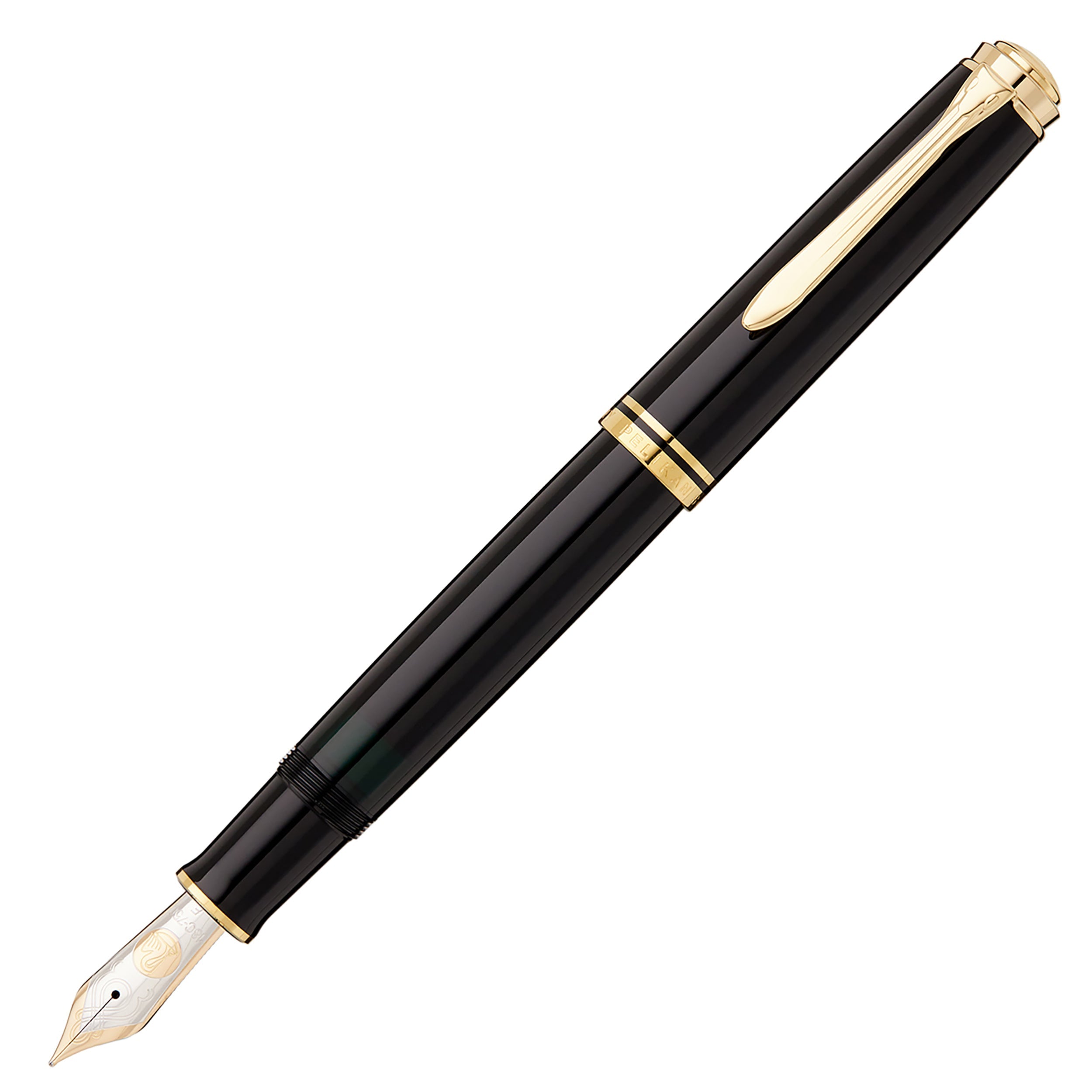
The M800 in black — the only Souverän we carry in fine, and the width that fits between the lines of someone else's draft.
Exhibit B — The Medium Nib
Built for signatures, letters, and the pen people notice.
A medium nib is the width most fountain pen owners settle on for their primary pen — wider than fine, generous with ink, and smoother on the page because more of the tipping's rounded surface is in contact with the paper at once. It's the width that makes handwriting look like handwriting, with the kind of visible ink shading a ballpoint can't produce.
It's also the more forgiving width in practical terms. A medium nib writes reliably under normal pressure and in any direction — no special grip or light touch required — and it handles nearly any smooth, uncoated paper without complaint, which is one reason it's the width most people never think twice about once they've chosen it.
- AShoulder — the same anchor point as any Pelikan nib; the section grips here regardless of width.
- BBreather hole — same function as the fine nib's, slightly larger to keep pace with faster ink flow.
- CSlit — wider-set and more flexible than a fine nib's, moving more ink to the tip with less resistance.
- DTipping — ground larger and rounder than a fine nib's, which is what puts more of it in contact with the page.
| Typical line width | ≈ 0.5–0.6mm |
|---|---|
| Ink use | Generous — refills more often |
| Best paper | Forgiving — handles most smooth, uncoated stock without much thought |
| Technique | None needed — writes reliably in any direction, any grip |
| Best for | Signatures, correspondence, the pen you actually reach for |
In Practice

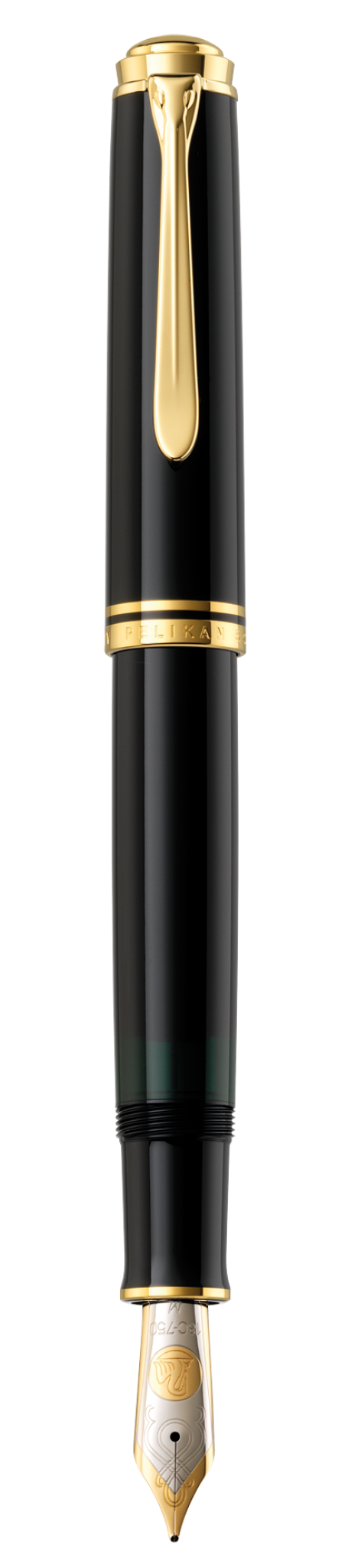
The M1000, stocked in medium — the width that makes a signature look written rather than printed.
The Docket
Which one, which moment
Four moments, and the case for each width.
Redlining a draft
Fine Nib
Interlineations and margin notes need a line that doesn't bleed into the text it's correcting.
Case notes / depositions
Fine Nib
Fast, dense, and small — a fine nib keeps up without turning a legal pad into a blot test.
Signing the closing documents
Medium Nib
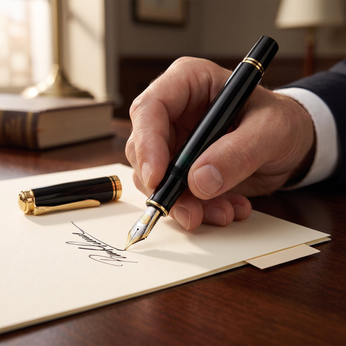
The one signature on the page people actually look at. Let it show a little ink.
Personal notes & gifting inscriptions
Medium Nib
Warmer on cream cardstock than a fine nib manages — this tier is built for occasions, not to-do lists.
Building the Kit
Four ways in
Every tier is a genuine Pelikan, made in Germany by a house continuously in business since 1838. The difference is nib material, fill mechanism, and how much presence the pen carries on the table.
Three of the four pens below fill by piston rather than cartridge — a mechanism Hungarian engineer Theodor Kovács patented in 19291 and licensed to Pelikan, who brought it to market the same year with a transparent ink window built in from the start2. That patent lapsed decades ago and other makers now build their own piston pens, but the mechanism is unchanged in principle since 1929: it shows you how much ink remains, holds more of it than a cartridge, and refills from any bottle. The exception is the P205, which uses a cartridge instead — part of why it costs and weighs less than the three above it.
Tier I — The Entry
Pelikan P205
Stocked in fine and medium
Steel nib, cartridge-and-converter fill, chrome trim. The lightest of the four and the only one that doesn't fill by piston. This is the pen to buy if you want to find out whether you like writing with a fountain pen before deciding how much you like it.
See the P205Tier II — The Step Up
Pelikan M200 Marbled
Fine in green-marbled · medium across the collection
The first piston filler in the range, with the ink window that has been part of the design since 1929. Steel nib, gold-plated trim, marbled resin barrel. Most of what makes a Pelikan a Pelikan, well short of the Souverän price.
See the M200Tier III — The Standard
Pelikan Souverän M800
Fine in black · medium across the collection
Solid 18K gold nib and a brass-sleeved barrel that gives the pen the heft people mean when they say a pen feels serious. If you intend to own one fountain pen for the rest of your practice, this is the one most owners settle on.
See the M800Tier IV — The Flagship
Pelikan Souverän M1000
Stocked in medium
The largest pen in the range, and the softest nib in it — an 18K nib with noticeably more give underhand than the M800's. Sized for a full grip and long-form writing rather than a shirt pocket.
See the M1000A Note on Availability
Fine nibs are stocked selectively rather than across the board. The P205 is carried in both widths. The M200 is carried in fine only in green-marbled, the M800 in fine only in black, and the M1000 in medium.
If the Docket above points you toward a fine nib at the senior tiers, write to us before you order. We will tell you what is on hand, what can be brought in, and roughly how long it will take. We would rather special-order the right pen than sell you a width you did not choose.
- U.S. Patent No. 1,706,616 (filed Sept. 15, 1927; issued Mar. 26, 1929); see also German Patent No. DE457462 (filed Sept. 29, 1926; issued Mar. 16, 1928) (Theodor Kovács, inventor). ↩
- The Piston Filling Mechanism, 1929–1950, Pelikan Heritage & Tradition Archive, archive.pelikan.com (licensing agreement with Günther Wagner dated Aug. 19, 1927; product launched as the Transparent Pelikan Fountain Pen, 1929); see also The Patent That Launched a Fountain Pen Empire, The Pelikan's Perch (Oct. 2, 2020). ↩
Exhibit C — Anatomy of a Nib
The detail that decides how a pen feels in ten years.
Steel — standard on the P205 and most M200s, steel nibs are firm and consistent from day one: what you feel at first is close to what you'll feel in year ten, and they're cheaper to produce, which is part of why the entry tiers cost less than the Souveräns above them.
18K gold — standard on the M800 and M1000, gold nibs flex slightly under normal writing pressure and don't corrode, so most owners find one quietly adapts to their hand over time. The nib itself is solid 18K gold — it's the pen's trim (cap bands, clip, rings) that's gold-plated brass.3 Either way, the tipping that actually touches the paper is the same hard tungsten alloy; gold changes the flex, not the wear.
- Pelikan-Collectibles, M800 Basis (Souverän Series) spec table, pelikan-collectibles.com/en/Pelikan/Models/Souveraen-Series/M800-Basis (listing the nib as 18K/750 solid gold and the trim separately as gold plated); see also The Pelikan's Perch, Putting Karats To Paper: The Various Gold Purities Of Pelikan's Nibs (Nov. 23, 2021), thepelikansperch.com/2021/11/23/pelikan-gold-nibs (two-tone rhodium plating is applied over a solid gold nib, not a base-metal substitute). ↩
The Argument
The Pelikan Brief
Why Pelikan earned a place in this catalog — the case for the file.
A curated catalog means every item had to earn its place, not just be available. Three grounds are why Pelikan did.
Ground I — Continuity
One house since 1838
Pelikan has been in continuous business since 1838 and built fountain pens since 1929, including piston-fill engineering unchanged in principle across the century since4 (see also notes 1–2, supra). A house that has serviced its own mechanism for a hundred years is a safer long-term bet than one that has changed hands recently.
Ground II — The Nib
Solid gold, verifiably
At its senior tier, Pelikan's nib is solid 18K gold, not a spec-sheet phrase that quietly means something thinner (see note 3, supra) — a claim a skeptical reader can check against the maker's own documentation.
Ground III — The Look
Traditional, on purpose
Pelikan's striped resin barrels and gold nibs were never designed to look modern. They sit in the same traditional register as the leather and brass this catalog is built around — part of the collection, not an accessory bolted onto it.
- The 1838 date traces to the Hannover ink and artists' colour works of Carl Hornemann; Günther Wagner acquired the business in 1871 and registered the pelican mark in 1878. The firm's first fountain pen followed in 1929, together with the piston mechanism described in notes 1–2, supra. Ink and artists' materials, not pens, are what the 1838 date refers to. ↩
Closing Argument
A signature is the one piece of handwriting in a legal career that gets read as carefully as it's written — on a closing, a judgment, a partnership agreement. Nib width is a small, permanent decision that shapes every one of them. Choose based on what you're actually writing, not the size chart, and you'll rarely choose wrong.
Shop Pelikan Fountain PensMORE FROM THE FIELD GUIDE
Padfolio, or Portfolio?
Card Case, or Card Wallet?
A Cigar, Counselor?
The Churchill, or the Silk?
The Catalog Case: Hand Carry or Wheeled?
Season It, or Ruin It?
The Shirley, or the Camilla?
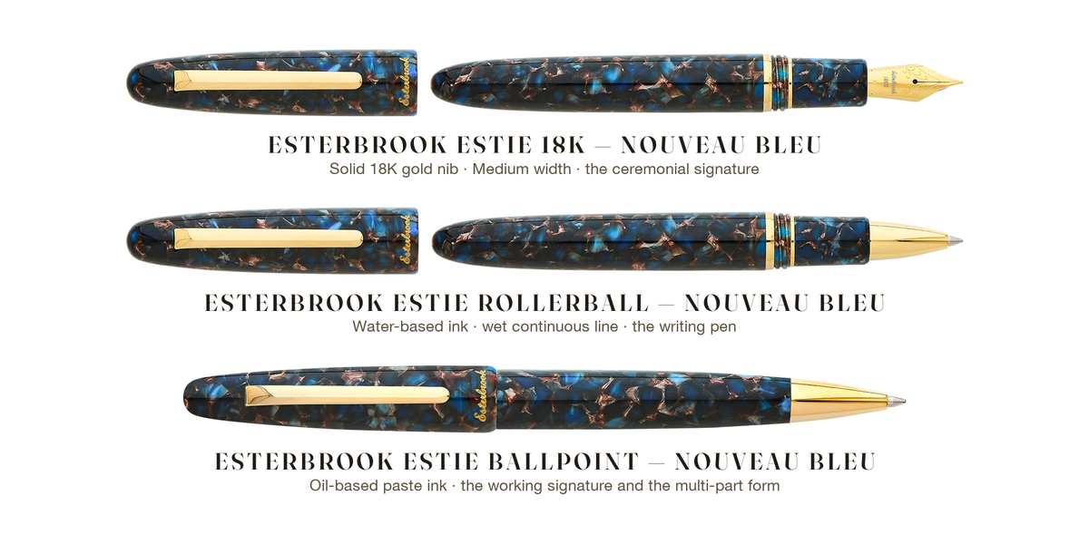
Fountain, Rollerball, or Ballpoint?

Written by James Kaywell